The Map That Never Dies: Why This Misleading Electoral Visualization Still Works in 2025
On November 5, 2025, the White House posted a map on X (formerly Twitter) with the caption: "The map that made the left cry. Never forget. 🏆"
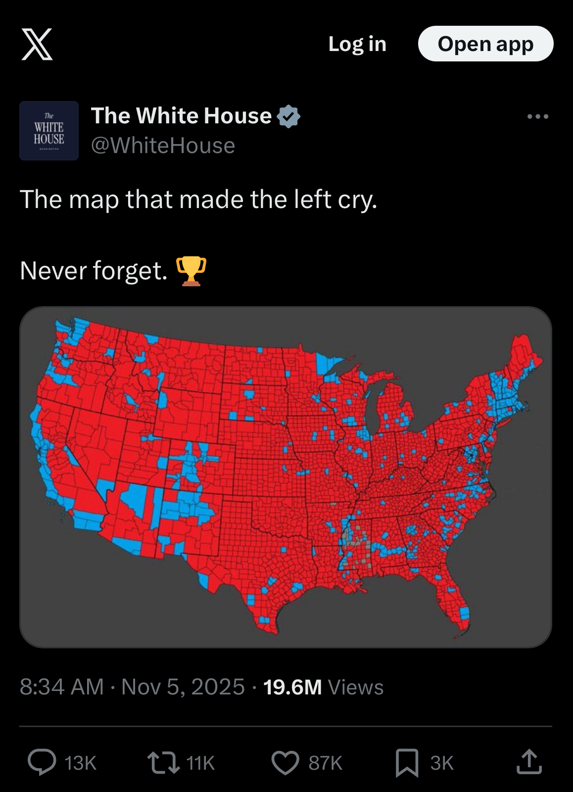
The map shows the 2024 presidential election results by county, with vast swaths of red (Republican) dominating the map, punctuated by small pockets of blue (Democrat). At the time of writing this article, is has garnered 19.6 million views, 87,000 likes, and 11,000 reposts.
There's just one problem, this map is specifically designed to be misleading.
Not in the sense that the data is wrong, the counties are colored correctly based on which candidate won. But in the sense that the visualization fundamentally distorts what it claims to show how Americans voted.
This isn't new. Data visualization experts, statisticians, and journalists have been writing takedowns of this exact type of map since at least the 2016 election. Probably earlier. The phrase "land doesn't vote, people do" has become a meme, repeated so often it's practically a cliché in data viz circles.
And yet, here we are in 2025, with an official U.S. government social media account sharing this misleading visualization to millions of people. Not your uncle on Facebook. Not a random partisan account. Not some random social media influencer. The White House.
Why does this particular misuse of data persist? Why does it work so effectively, even after countless debunkings? And most importantly, what can we learn from the fact that a known, documented visualization trick continues to fool millions of people?
Let's break it down.
The Map and What It Claims to Show
The map purports to show how the country voted in the 2024 presidential election. Each county is colored either red (Trump won) or blue (Harris won), based on which candidate received more votes in that county.
At first glance, the visual message is overwhelming: Trump won in a landslide. Red dominates the map. Blue appears as scattered, isolated islands in a sea of red. The geographic coverage suggests massive, comprehensive support for Trump across the vast majority of American territory.
This is the intended emotional impact: "Look at all that red! The Democrats are confined to tiny coastal enclaves and a few urban pockets. This is what America chose."
And for millions of viewers who aren't trained in data visualization, that emotional impact translates directly into a belief about electoral reality.
But there's a fundamental problem, the map confuses land area with vote count.
🚩 Red Flag #1: Geographic Area ≠ Population
The core issue is simple, but worth stating explicitly:
A county's geographic size has nothing to do with how many people live there or how many votes were cast there.
Consider these examples from the 2024 election:
San Bernardino County, California:
Geographic area: 20,105 square miles (the largest county in the U.S. by area)
Population: ~2.2 million people
Votes cast: ~640,000
Result: Harris won by 5 points
Los Angeles County, California:
Geographic area: 4,751 square miles
Population: ~10 million people
Votes cast: ~3.8 million
Result: Harris won by 26 points
Loving County, Texas:
Geographic area: 677 square miles
Population: ~64 people (smallest county in the U.S. by population)
Votes cast: ~38
Result: Trump won with ~30 votes
Now, here's the visualization problem. On a standard county map, Loving County (38 votes) takes up more visual space than dozens of densely populated urban precincts combined.
The map treats these wildly different entities as if they're equivalent. A county with 38 voters gets just as much visual weight as a county with 3.8 million voters, if not more, depending on geographic size.
This creates an inverse relationship between visual prominence and actual voter impact. The less populated a place is, the more likely it is to have disproportionate visual representation on the map.
Why This Matters
When your brain processes this map, it attempts to estimate the relative strength of each color by measuring the amount of red vs. blue you see. This is natural and automatic. It's how our visual system works.
But because rural counties are geographically enormous and sparsely populated, while urban areas are geographically compact and densely populated, the visual distribution is systematically inverted from the actual vote distribution.
In other words, the map shows you the opposite of what it claims to show.
You think you're seeing "how America voted." What you're actually seeing is "where America has empty land."
The Lesson
Geographic maps are designed to show geographic information, not population information. When you use a geographic map to represent population data (like votes), you introduce systematic bias unless you adjust for population density.
This isn't a partisan issue, it's a fundamental data visualization principle. If the results were reversed and Democrats won rural areas while Republicans won cities, the problem would be identical.
🚩 Red Flag #2: Winner-Take-All County Coloring Hides Margins
The second major problem with this map is that it uses binary winner-take-all coloring where each county is either 100% red or 100% blue, based solely on which candidate got more votes.
This means:
A county where Trump won 98-2: Solid red
A county where Trump won 51-49: Solid red
A county where Harris won 51-49: Solid blue
A county where Harris won 75-25: Solid blue
The map provides no information about margin of victory, which is crucial for understanding actual voter sentiment.
Real-World Impact
Let's look at a concrete example:
Maricopa County, Arizona (includes Phoenix):
Population: ~4.5 million
Votes cast: ~2.1 million
Result: Trump won by 3.5 points (51.7% to 48.2%)
On the standard county map, Maricopa County appears as solid red, visually suggesting Trump dominated. In reality, nearly half the voters (48.2%) chose Harris, representing roughly 1 million people.
That's one million people whose votes are visually erased from the map because they were on the losing side of a close race.
Multiply this across every competitive county in America, and you have millions of voters whose existence is hidden by the visualization.
The Lesson
Binary color coding cannot represent nuanced results. When you reduce continuous data (vote margins) to binary categories (win/loss), you lose critical information and create misleading impressions of dominance or consensus where none exists.
🚩 Red Flag #3: The Psychology of Color Density
Even if you understand logically that land area doesn't equal population, the visual impact of color distribution is psychologically powerful.
Our brains are wired to interpret more color = more of whatever that color represents. When we see a map that's 80% red and 20% blue, our intuitive response is: "80% of something is red."
But what is that "something"?
On this map, it's land area. But most viewers unconsciously interpret it as:
80% of voters chose red
80% of the country supports red
Red won by a huge margin
None of these interpretations are accurate. But the visual language of the map encourages these misinterpretations through the sheer dominance of red color density.
The 2024 Reality
The actual 2024 popular vote results:
Trump: 49.8% (77.3 million votes)
Harris: 48.3% (75 million votes)
Margin: 1.5 percentage points
This was the second-closest popular vote margin since 1968. It was a narrow win, not a landslide.
Yet the county map suggests a blowout of historic proportions.
The Lesson
Visual metaphors can overwhelm factual knowledge. Even when people know the numbers, the emotional impact of "all that red" creates a psychological impression that competes with, and often overrides, factual understanding.
This is why misleading visualizations are so dangerous, they can create false intuitions that persist even after exposure to correct information.
🚩 Red Flag #4: The Urban-Rural Population Distribution
To understand why this map is so systematically misleading, you need to understand America's population distribution:
Urban/Suburban America:
Roughly 80-85% of Americans live in urban or suburban areas
These areas are geographically compact
They appear as small dots on a county map
Rural America:
Roughly 15-20% of Americans live in rural areas
These areas are geographically vast
They appear as large regions on a county map
This means that when you color a county map by election results, you're essentially creating a map of population density, not political sentiment.
The map doesn't really tell you "how the country voted." It tells you "where people don't live."
The Pattern Across Elections
This isn't specific to 2024 or to Republican victories. The same pattern appears in every election:
Rural areas vote more conservative → geographically large → visually prominent
Urban areas vote more progressive → geographically small → visually diminished
If you made a county map of the 2020 election (which Biden won by 4.4 points), it would still look mostly red because rural areas are still geographically enormous.
In fact, you could theoretically have a candidate win the popular vote by 10 points and the electoral college comfortably, and the county map would still be mostly red if their support was concentrated in cities.
The map is fundamentally broken for representing electoral outcomes.
The Lesson
The structure of the visualization embeds a systematic bias that doesn't correlate with the thing you're trying to measure. When your visualization method inherently favors one outcome regardless of the underlying reality, it's not informing rather it's misleading. And often misleading by design.
🚩 Red Flag #5: Alternative Visualizations Exist (And Aren't Used)
Here's the thing that makes this particularly egregious, we have better ways to visualize this data.
Data visualization experts have developed multiple alternatives that account for population:
Cartograms (Size-Adjusted Maps): Resize each county or state proportionally to its population, so visual area actually represents number of people. This maintains geographic relationships while correcting the population bias.
Dot Density Maps: Place dots representing individual votes or groups of votes at their geographic locations. Densely populated areas naturally show more dots, creating an accurate visual representation of where votes were cast.
Circle/Bubble Maps: Overlay circles on the map where the size represents vote totals and the color represents who won. This preserves geographic context while adding population information.
Purple/Gradient Maps: Instead of binary red/blue, use color intensity to show margin of victory. Purple for competitive areas, dark red/blue for landslides. This shows both winner and competitiveness.
Nightlights Filtering: Use satellite data of light pollution (which correlates with population) to filter the map, showing only populated areas. This eliminates the visual dominance of empty land.
All of these approaches have been developed, refined, and published. Many go viral alongside the misleading maps, with people sharing "land doesn't vote, people do" corrections.
Yet the standard geographic county map persists.
Why?
Because the misleading version is more emotionally powerful.
A corrected map shows what the data actually says, that elections are close, the country is closely divided, urban and rural Americans have different priorities, and victory comes down to narrow margins in a handful of places.
The misleading map shows what partisans want to see, overwhelming dominance, mandate for action, proof that "we" are the majority and "they" are fringe.
Which one is more shareable? Which one confirms existing beliefs? Which one feels better to post?
The misleading version wins on emotional impact, even though it loses on accuracy.
The Lesson
Better information doesn't automatically displace worse information if the worse information is more emotionally satisfying. Truth needs to be communicated in ways that are not just accurate but also psychologically compelling, or it will be outcompeted by attractive falsehoods.
🚩 Red Flag #6: The White House Should Know Better
Let's be clear about what happened here:
The official White House social media account, representing the executive branch of the United States government, posted a visualization that:
Has been debunked repeatedly for nearly a decade
Violates basic principles of data visualization
Systematically misrepresents electoral reality
Appears designed to mislead rather than inform
This wasn't posted by a random staffer. This wasn't accidentally shared. The caption ("The map that made the left cry") makes clear this was intentional. A propaganda piece designed to gloat, not to inform.
And it worked. 19.6 million views. Massive engagement. Mission accomplished.
The Institutional Problem
When government institutions abandon even the pretense of honest communication in favor of partisan propaganda, they:
Erode trust in official information
Normalize misleading uses of data
Model bad behavior for the public
Contribute to epistemic polarization (different groups living in different factual realities)
The White House has communications professionals. It has access to data visualization experts. It has the resources to create accurate, informative content.
Choosing to post misleading content instead is a choice to prioritize propaganda over truth.
The Lesson
Institutional credibility matters. When trusted sources intentionally mislead, they don't just deceive on that one issue, they undermine the entire framework of shared facts that makes democratic discourse possible.
🚩 Red Flag #7: Why This Map Never Dies
Despite nearly a decade of debunkings, this map persists and goes viral after every election. Why?
It Confirms Existing Beliefs
For Trump supporters, the map "proves" what they already believe, that they represent "real America" and that Trump won overwhelmingly. The visual metaphor aligns with their worldview.
For Trump opponents, the map is frustrating because it so obviously misrepresents reality, which confirms their belief that the other side is manipulated by propaganda.
Both groups share it, for opposite reasons. It becomes evidence in their respective narratives.
It's Simple
The standard county map requires no explanation. You don't need to understand cartograms or density corrections or statistical principles. Red place = Trump won. Blue place = Harris won. Done.
Corrected visualizations often require explanation,"This adjusts for population by..." Most people won't read the explanation. They'll scroll past. We are lazy like that.
Simplicity wins, even when simplicity misleads.
It's Emotionally Powerful
Seeing a sea of red creates a visceral, emotional response. It feels like dominance, like mandate, like "this is what real Americans chose."
Corrected maps that show a nearly 50-50 country don't create that emotional hit. They're unsatisfying. They don't provide the catharsis of feeling like you won decisively.
Emotion beats accuracy in virality.
It Serves Political Goals
For Republican politicians and operatives, the misleading map is useful:
Claims of "mandate" justify aggressive policy
Visual "proof" of dominance intimidates opponents
Reinforces rural identity politics ("we're the real America")
Fundraising ("look how much support we have!")
There's no incentive to correct it. The misleading version is strategically valuable.
The Lesson
Misinformation persists when it serves psychological and political needs that truth doesn't satisfy. Debunking isn't enough. You need to understand why people want to believe the false thing and address those underlying needs.
The Bottom Line
The county electoral map isn't technically lying, the data is accurate. But it's deceptive in exactly the way that's most dangerous in that it presents factual information in a format that systematically misleads viewers about what that information means.
When the White House shares this map with gloating language, they're not making an innocent mistake. They're weaponizing a known data visualization flaw for propaganda purposes.
And it works, because:
Most people don't understand data visualization principles
The emotional impact is immediate and powerful
It confirms what partisans want to believe
Corrections require explanation and nuance
Simple misleading beats complex accurate
This is a case study in how misinformation persists even after repeated debunking: The correct information exists. The debunkings exist. Better alternatives exist. None of it matters if the misleading version is more emotionally satisfying and serves political goals better than the truth.
What You Can Do
When you see someone share this misleading map:
Don't:
Just say "land doesn't vote, people do" without explanation (they've heard it and don't care)
Get into partisan arguments about who won (Trump clearly won)
Dismiss the sharing as stupidity (smart people fall for this too)
Do:
Share better visualizations (cartograms, population-adjusted maps)
Explain why the standard map is misleading (area ≠ population)
Provide the actual vote totals and margins (context matters)
Ask: "What do you think this map is showing?" (Socratic method works)
Reference respected, non-partisan sources on data visualization
Remember:
This isn't about contesting who won (Trump won)
This is about accurate vs. misleading communication
This is about data literacy and informed citizenship
This is about holding institutions accountable for honest communication
Final Thoughts
We're now nearly a decade into the era of this misleading map going viral after every election. The fact that we're still dealing with it, that the White House is still sharing it, tells us something important:
Debunking isn't enough.
The data visualization community has done its job. The explanations exist. The corrections exist. The better alternatives exist.
But if we want to actually solve this problem, we need to understand that this isn't really about maps or data visualization. It's about the psychology of belief, the sociology of information sharing, and the political economy of truth.
People share this map because:
It makes them feel good
It confirms their worldview
It helps their side politically
It's emotionally powerful
Correcting it feels like admitting weakness
Until we address those underlying motivations, we'll be debunking this map after every election for the next decade too.
The map will never die because it serves needs that truth alone cannot satisfy.
That's uncomfortable. But it's what we need to understand if we want to build a citizenry that can't be so easily manipulated by misleading data visualization.
Further Reading:
Postscript
There's a final irony here, the corrected visualizations actually make Trump's 2024 victory more impressive.
When you properly account for population and show the true closeness of the race, Trump's ability to win despite:
Facing an incumbent party
Being outspent in advertising
Having multiple legal challenges
Negative media coverage
Lower favorability ratings
...becomes a more interesting story. How did he thread the needle in exactly the right states by exactly enough votes?
The misleading map suggests he won easily. The accurate analysis shows he executed a narrow but effective strategy in exactly the places that mattered.
The truth is actually more interesting than the propaganda. But propaganda is simpler, emotionally satisfying, and serves political goals.
And that's why, in 2025, we're still debunking the same map we've been debunking since 2016.