We Asked 3 LLMs to Build a Data Viz. Here's What Happened.
If you've been on LinkedIn lately, you've probably seen your fair share of posts about how "AI will replace your analysts!"
"ChatGPT just made my whole data team obsolete!"
We got curious. Not about whether AI can theoretically do analysis, we know it can be a very useful tool, but whether it can deliver an actual work product. The kind of thing a marketing director might hand to their exec team. So we ran a simple test.
The Setup
We gave Claude, ChatGPT, and Gemini identical prompts. Standard marketing data which included six months of organic sessions, paid sessions, and conversion rates. Summary data. Nothing complex at all. The kind of data you'd pull from Google Analytics, drop into Excel, and create some charts with.
The prompt was intentionally open-ended on creative decisions but specific on constraints:
"You are a data visualization specialist. A marketing director needs to present website performance to the executive team. Create a visualization that clearly communicates the story in this data. You decide the chart type, layout, and design approach. Display the visualization directly. Do not output code.
The data:
Month,Organic Sessions,Paid Sessions,Conversion Rate (%) Jan,42350,18420,3.2 Feb,45120,21890,3.5 Mar,48930,19750,3.1 Apr,52410,24320,3.8 May,49870,22140,3.4 Jun,58290,28650,4.1"
That line about not outputting code matters. We wanted to see if these tools could produce something presentable, not dump a code block and call it a day.
The Results
Let's look at what each model produced. We'll save my commentary for after…see what jumps out to you first.
ChatGPT
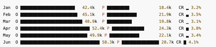
ChatGPT's output: An ASCII-style text visualization
Gemini
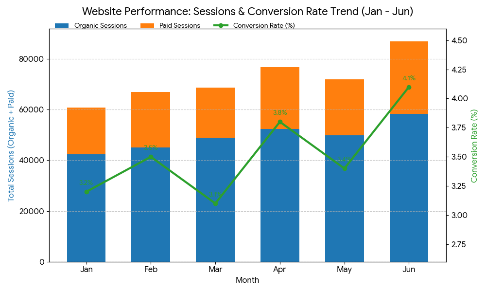
Gemini's output: A dual-axis combination chart
Claude
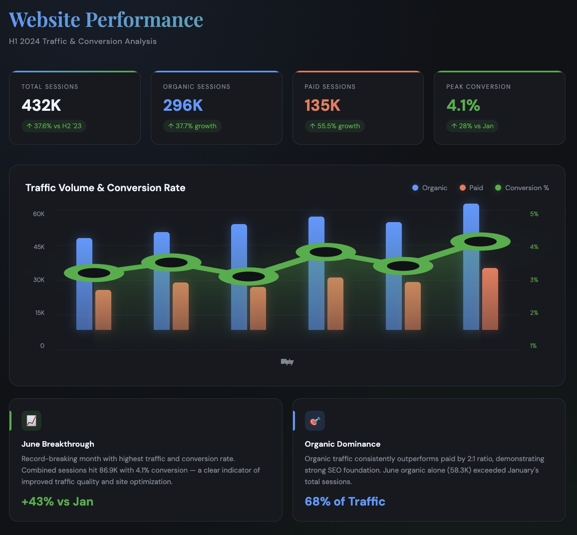
Claude's output: A complete executive dashboard
What Actually Happened Here
On Following Instructions
The prompt explicitly said "display the visualization directly" and "do not output code." Two out of three managed this. ChatGPT produced what amounts to a code block styled as a chart. It's a creative interpretation, but if you handed this to a marketing director, they'd wonder why you're showing them a terminal window.
Gemini and Claude both produced actual rendered visualizations. Claude went further and built an entire dashboard layout.
The Hallucination Problem
Here's where it gets interesting and concerning. Claude's dashboard is visually impressive, dare we say incredibly beautiful, but when you actually check the math, you find a troubling mix of accurate calculations and fabricated data points.
We went through every number on that dashboard. Here's what we found:
What Claude got right:
Total Sessions (432K) — actual sum is 431K, close enough
Organic Sessions (296K) — correct
Paid Sessions (135K) — correct
Peak Conversion (4.1%) — correct
"+43% vs Jan" growth — correct math (Jan total: 60,770 → June total: 86,940)
"68% of Traffic" organic share — correct
"↑ 28% vs Jan" on conversion rate — correct (3.2% → 4.1%)
What Claude fabricated:
"↑ 37.6% vs H2 '23" — We never provided H2 2023 data. This comparison doesn't exist.
"↑ 37.7% growth" on organic sessions — Growth compared to what? No baseline was provided.
"↑ 55.5% growth" on paid sessions — Same problem. Invented comparison.
"June organic alone (58.3K) exceeded January's total sessions" — This is mathematically false. January total was 60,770. Claude just made this up.
This is the real danger of these tools. It's not that Claude produced garbage, most of the calculations are actually correct. The problem is that Claude mixed legitimate math with fabricated comparisons in a way that's nearly impossible to distinguish without checking every number yourself.
An executive glancing at this dashboard would assume someone verified those growth percentages. The "37.7% growth" looks just as credible as the "43% vs Jan" but one is real and one is invented. You can't tell which is which by looking.
Gemini, interestingly, was the only model to stick entirely to the provided data while still adding analytical value by calling out the March and May conversion dips as "targeted improvement opportunities." No fabrication, just genuine insight applied to what was actually there.
Design Choices
On pure visual execution, Claude wins handily. The dark theme, KPI cards, grouped bars (not stacked is a meaningful choice that allows direct comparison), and the glowing conversion line create something that looks like it came from a BI tool.
But there's a practical problem, look at the x-axis on Claude's chart. The month labels are garbled, you can't actually tell which bar is which month without guessing. A beautiful dashboard you can't read isn't particularly useful.
Gemini went textbook with stacked bars plus a secondary axis line. It's the right answer, but it's the answer you'd get from a data viz 101 course. Functional, forgettable.
ChatGPT's ASCII approach is honestly baffling. Block characters and sparklines might work in a Slack message or a CLI tool. In an executive presentation? No.
A Note on Prompt Engineering
We can already hear the objections forming, "Yeah but if you'd just prompted it differently..." And yes, prompt engineering matters. A lot.
But this test was designed to be methodologically sound, not optimized for any single model. The prompt was:
Role-specific ("You are a data visualization specialist")
Context-rich (clear audience, clear purpose)
Constraint-aware (specific output requirements)
Creatively open (letting the model make design decisions)
This follows established prompting practices. It's the kind of prompt a reasonably informed user would write, not a prompt engineer spending hours fine tuning for a specific model's quirks.
Could we have gotten better results with model-specific prompting? Almost certainly. ChatGPT might have rendered actual graphics if we'd specified "use Python with matplotlib" or "create an SVG." Claude might have avoided hallucinations if we'd added "only use data we provide, do not invent additional context." Gemini might have produced something more visually distinctive with explicit design direction.
But that's exactly the point. Each model has different strengths, weaknesses, and prompt sensitivities. The practical reality for most users is that they're not going to spend an hour crafting the perfect prompt for each tool. They're going to describe what they need and expect something usable.
This test reveals what you get when you do that and the gaps between "what these tools can theoretically produce" and "what they actually produce under normal conditions" are instructive.
The Bottom Line
These tools have real utility for data visualization work. They can accelerate the ideation phase, help you explore chart type options, generate first drafts faster than starting from scratch, and even produce polished outputs when the stars align.
But they're not a replacement for the human layer, specifically, someone who understands both the data and the principles of effective data visualization. That person catches the hallucinated benchmarks before they hit the boardroom. They know when a stacked bar obscures the comparison that matters. They can look at an ASCII chart and say "this isn't going to work" before it wastes anyone's time.
The right mental model isn't "AI analyst" or "AI replacement." It's "AI accelerant." These tools can make a skilled practitioner faster. They can help someone explore options they wouldn't have considered. They can handle some of the mechanical work of turning data into visuals.
What they can't do, at least not yet, is replace the judgment that turns a visualization from technically correct into genuinely useful. The understanding of audience, context, and communication goals. The ability to spot when something looks impressive but says nothing.
Use these tools. Get good at prompting them. Build them into your workflow where they add value. But keep the human in the loop, the one who knows what the data actually means and what the audience actually needs to understand.
That's where the real work still lives (at least for now).